Introducing Ink’s new brand identity
When Ink was founded, the team wasn’t focused on brand architecture or broad product portfolios. We were solving a practical problem: build a check-in system that could compete with pen and paper.
At the time, we built fast, simple, cost-effective solutions. While much of the industry still relied on manual processes, local software, green screens, and bulky desktops, we embraced cloud-first technology well ahead of time.
For years, we helped digitise travel step by step. But by 2025, the world, infrastructure, and traveller expectations have evolved — and so have we.
Ink CEO Shawn Richards reflects:
“As a company name closely associated with paper, one of our first challenges was to replace manual check-in, and we did. Then, over 10 years ago, we tackled mobility. About five years ago, we expanded into new areas and grew significantly. Our name change to ‘Ink Innovation’ marked this diversification. Now, more than ever, airlines and airports need to become truly digital. We've made necessary decisions, investing time in work to simplify and align our activities with this vision.”
A travel industry in transition
Today’s travellers want more flexibility, responsiveness, and less friction.
The industry is adapting. New models and IATA retailing initiatives reshape airline systems around services, not processes. What was once rigid and sequential is now modular and dynamic. Seats, bags, changes, even flights — all treated as services to be delivered, not just managed.
This shift demands lighter, faster infrastructure built to orchestrate journey parts. It defines what we’re building — a service delivery platform helping airlines break free from legacy heritage.
Ink and its brand are evolving, reflecting these new standards, liberated from the past.
What stays constant is ‘Ink’
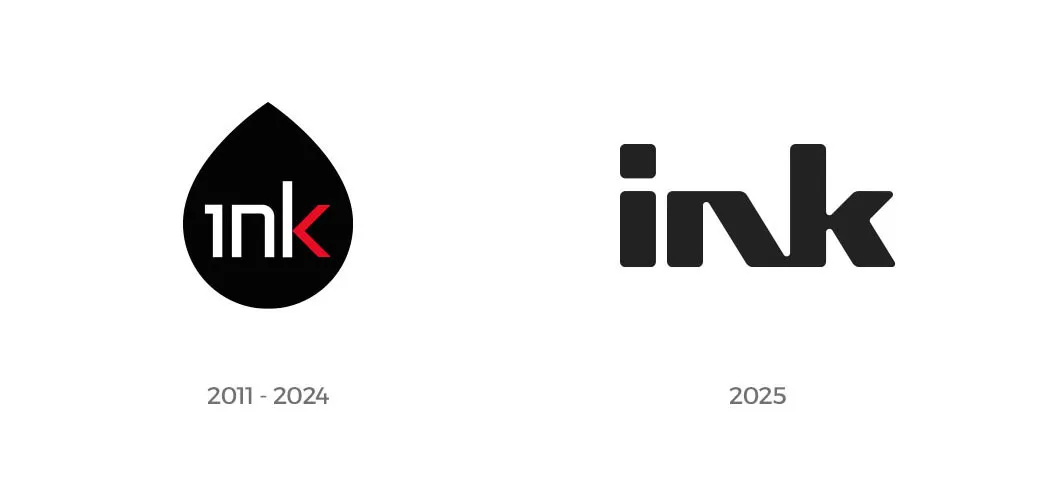
Our name was chosen for clarity, permanence, and tangibility — a nod to how knowledge was recorded long before pixels. The original logo placed ‘Ink’ over a drop — a visual echo of that purpose. It wasn’t flashy. It worked.
But today’s environment, shaped by real-time services and hybrid journeys, needs a new representation. The drop no longer reflects a fully digital future.

A design philosophy that mirrors Ink's evolution
Our new brand reflects the core principle guiding our work: simplicity.
Luis Renes, Creative Director at Ink, says:
“The new logo type is clean, balanced, and clear at any scale, something our old logo lacked. Custom typography and shapes make the logo unique. Crafted by hand, every curve and line is intentional. Unlike the earlier ink drop, this design is versatile and ideal for digital platforms and product branding. Our philosophy is to be straightforward and genuine.”
This mirrors our product evolution — from isolated features to a modular platform with a smaller footprint, simplified logic, and AI-led automation.
A brand built to deliver more by doing less
Simplification has always been core to us. Today, making travel effortless means giving airlines the tools to bring services together, respond quickly, and adapt without adding complexity to the legacy stack.
We didn’t redesign Ink simply to look different.
We redesigned it to stand for something different.
This launch is just the beginning. You’ll see continued focus on simplification. Over the coming weeks, we’ll introduce new products supporting a more effortless way to travel.


